Introduction
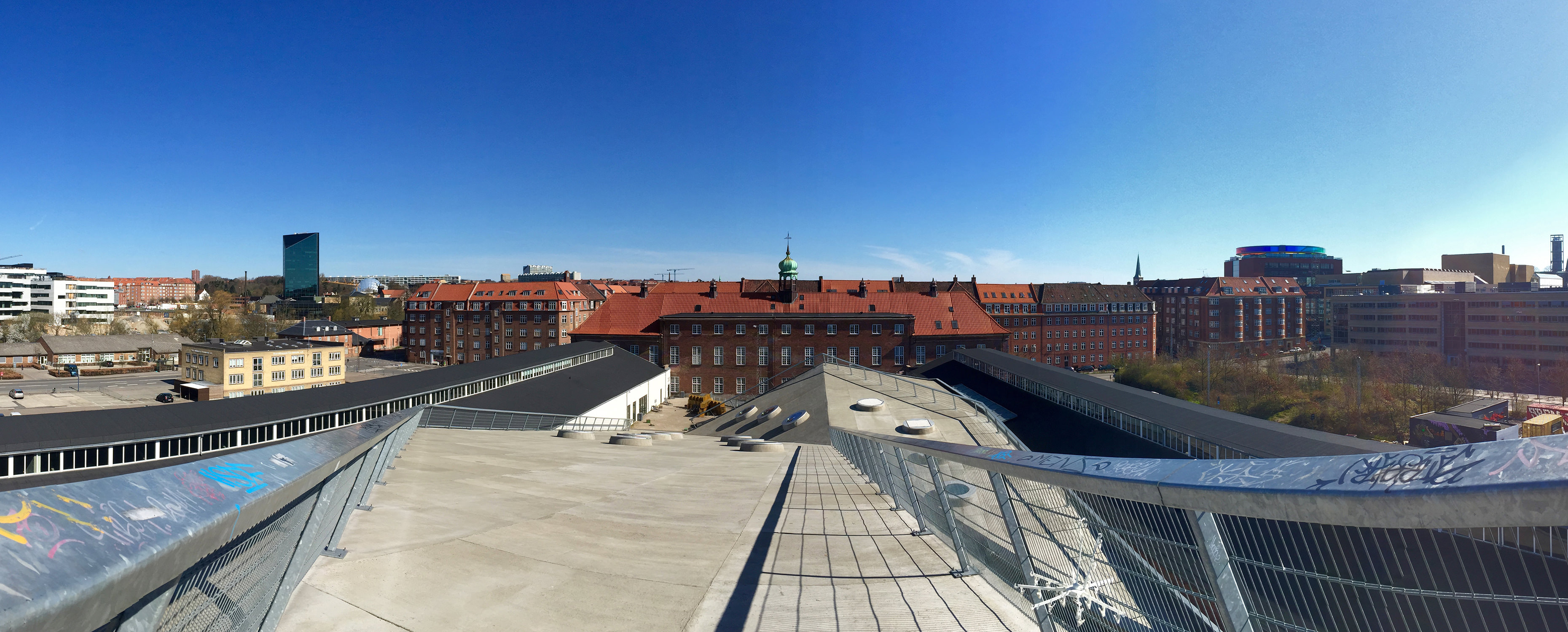
Paver was initially a simple personal project to make panoramas more accessible. After upgrading from an iPhone 4 to a spanking new 6, I unlocked the world of panoramas made by a single, steady wave of the hand. Panoramas are breathtakingly beautiful when used correctly, but I have always been frustrated with how the default screens, in aspect ratios that are largely incompatible with the ultrawide format of panoramas, don't do these work much justice.
Current status:
The conundrum
There is indeed an extremely lightweight way of displaying panoramas on a page—you simply wrap it within a container which allows content to oveflow along the x-axis. The markup is straightfoward:
<div class="panorama">
    <img src="/path/to/image" alt="" title="" />
</div>
…and the CSS (in SASS/SCSS flavour) would look something like this:
.panorama {
	height: 400px;
	overflow-x: scroll;
	overflow-y: hidden;
	img {
		height: 100%;
	}
}
Looks good! However, it requires user to drag the scrollbar in order to pan around the panorama. What if we can exploit mouse movement, and even device orientation/rotation, to enhance the user experience of panorama viewing? That is why Paver was developed. And here is the same panorama, with Paver enabled, working on the exact same markup as the panorama above:

How does it work?
There are two parts to how Paver works—firstly, it converts a simple markup, which is essentially an image wrapped in a division element, into something that the plugin can further work with. When that is done, it uses JS to listen to several events that will indicate how the user would want the panorama viewport be positioned.
Markup replacement
Paver works by replacing your markup, which would look something like this:
<div>
    <img src="/path/to/image" alt="" title="" />
</div>
…into…
<div class="paver--init paver--ready">
    <!-- Panorama metadata -->
    <div class="paver__meta">
        <span class="paver__title">Title</span>
        <span class="paver__desc">Description</span>
    </div>

    <!-- Panorama as background image -->
    <div class="paver__pano"></div>

    <!-- Panorama scroller -->
    <div class="paver__scroller">
        <span></span>
    </div>
</div>
Usage
Dependencies
Paver requires jQuery v1.7+, as well as Ben Alman's jQuery Throttle/Debounce plugin. For jQuery, you can use the one hosted by Google API, or the stable releases hosted by jQuery CDN—Paver has been thoroughly tested with jQuery v1.7+, v2+, and v3.1+. For the throttle/debounce plugin, you can use the one available via cdnjs.
Remember, for Paver to work, you will have to load both the plugin's JS file (paver.js or paver.min.js, after the dependencies) and the accompanying stylesheet (paver.css).
Basic usage
For the HTML structure, refer to the minimal basic markup. To initialize Paver, simply chain the .paver() method to your selector of choice. With reference to the minimal basic markup, this would be:
$(function () {
    // Paver
    $('div.panorama').paver();
});
As per standard jQuery plugins, .paver() will return the original object, allowing for further chaining if desired. For configuration options, please refer to configuration options.
Demo
A simple demo of how Paver works. You can resize the viewport to your liking, and Paver will automatically recalculate and recompute all necessary bits and pieces that make it work. The following panorama follows the suggested markup as specified above, but nested within a <figure> element to give context to the caption:
<figure>
<div data-paver>
<img src="./images/p1.jpg" title="Sunset in the heart of Aarhus" alt="A panorama taken from the roof of my penthouse unit in the center of Aarhus." />
</div>
<figcaption>Sunset in the heart of Aarhus—A panorama taken from the roof of my penthouse unit in the center of Aarhus.</figcaption>
</figure>$(function () {
// Paver
$('div[data-paver]').paver();
});
Features
-
Orientation-adjusted motion detection
Paver uses
deviceorientationto access the gyroscope data from a device, if available. It translates rotation along the x and z axis into panning action. More importantly, Paver intelligently sniffs out the screen orientation in order to perform motion translation properly. -
Mouse as a panning proxy
Paver listens to jQuery's proprietary
mousemoveevent, where the cursor position relative to the panorama container is recorded. Paver uses these coordinates to move the inner panorama image using CSS3 transforms. -
Responsive & mobile-friendly
Paver reacts to viewport size changes, and is smart enough to determine when panning is no longer necessary in order to view the panorama in its entirety. It also intelligently checks on screen orientation on mobile devices, so it will work flawlessly regardless of your device orientation.
-
Graceful degradation
No JS? No problem—with the basic styles in place, your panorama can still be viewed in its all its beauty even when the end-user have JavaScript turned off in their browser. Paver also offers the option to display failure messages when gyroscopic data is unavailable on mobile, touch-based devices.

The panorama above has a smaller aspect ratio than normal: Paver only kicks in when the viewport is narrow enough—so, resize away and see what happens.
Further Information
Usage notes & plugin configuration
For detailed usage notes, please refer to the Usage Notes page. Plugin configuration options are also available in the page.
Advanced usage
For examples of advanced usage, please refer to the Advanced Usage page.
Custom triggers & events
Paver supports custom triggers, which allows developers to force recomputation in the event of user-interaction that is not predicted, due to its non-exhaustiveness and limitless possibilities, by the plugin. In addition, Paver will also fire custom events to allow developers to track the initialization progress of the plugin. Please refer to Custom Triggers & Events for more information.
